In the penultimate We’ve Got It Covered post, I’m delighted to have cover designer Chris Howard answering my searching questions. Regular readers will know that Chris has designed the covers for my books, and I’m sure you’re all eager to find out more about him! Take it away, Chris …

Chris has worked as a professional musician and in 2005 worked for Compass group as a Graphic Designer, designing signage, promotional posters and other POS for restaurants in Google, Coca Cola, British Airways Terminal 5, BAA to name a few. Since 2010 Chris has worked as a freelance Graphic Designer and recent clients have included the Open University, InfoVista in Paris and Virgin Atlantic.
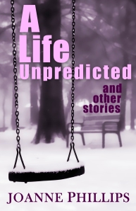
Recently Chris has been designing book covers for the indie market, producing covers for Joanne Phillips and Celina Grace among others. He is currently working on the cover for a Vampire novel by an American writer.

1. What is your favourite genre for cover design in general? Which do you think offers designers the best scope?
I think every kind of genre has it’s own challenges and is just as satisfying for me to design the best cover possible from Chick Lit to thriller. If anything I find Chick lit harder to design for as you are trying to convey an emotional feeling rather than a solid idea and in many ways it is more of an achievement to get it right.
2. Describe the worst cover you have ever seen. (Probably best not to name it!)
The worst designs I have seen are where the cover is trying to convey too much information from the book with a collage of events.
3. How about the best? What makes a perfect book cover?
The cover should not give too much away but should evoke an emotional response and intrigue in the reader to want to pick up the book.
The trick to a great cover is to either keep it simple with a powerful evocative image or have an elegantly designed illustration with close attention to colour and balance.
However the image is only half the story. Designers should pay just as much attention to the placement of text. The Author name and Title is usually what lets most covers down and can be the difference between a professional or amateur cover.
4. Some indie authors have been criticised for their covers: what are the most common mistakes authors make when designing or commissioning a cover?
Finding a great image is only the first step to a great cover. Authors who design their own covers, if they haven’t the expertise or software will often just place an image into a template sometimes distorting the aspect ratio. A raw photo is like a blank canvas to a designer and it is our job to transform an ordinary photo into an image that will jump out at you and demand your attention.
My advice to authors, send your commissions to me and concentrate on writing on your next masterpiece!!
5. How do you design a cover from scratch? A client comes to you and says, for example, ‘I want a brilliant, eye-catching cover for my new women’s fiction novel which is about marriage and love and loss.’ What would you do with that information?
As a designer when I receive a limited brief I immediately store away the initial flash of an idea from the information given in my head for later retrieval. Depending on the type of story I would either read the book first or otherwise I would get the general feel of the book by discussing the story line with the Author. Sometimes it is best not to get too bogged down with the detail which allows me create a les literal and more intriguing cover.
As with all creative work whether you are writer or designer, open up that blank page and get started. If there is a story or a cover in you it will soon appear on the page.

6. Which popular cover (let’s go with a mainstream author here) would you love to re-design, and what would you do with it?
The Casual Vacancy by J K Rowling. I know it was supposed to be a stark contrast to the flashy covers of the Potter books but I was disappointed by this cover. I was hoping that it would improve over time but for me I still don’t like it.
What would I do? As I said above.. open up that blank page and get started.
7. For my new series which I’m starting this year, I’d like to go with an illustrated cover, but these are much harder for indie authors – photos are easier to source than illustrations. What advice do you have for an author who is looking for something a bit different on a budget?
Illustration stock does tend to be more expensive but there is plenty of it out there. If you have a good eye you may be able to pick out some good stuff, but without a vector program like Adobe Illustrator you won’t be able to break apart the illustration and customise it for your design.
My advice as above: Ask me to help you !!
8. How important is text size in this era of the thumbnail image? Should titles be enormous and ‘pop’ out even in miniature, or is this another fallacy?
Most books you see on the book shelves do seem to have enormous titles and Author names but this is generally because the Author is so well known and that is what is going to attract the customer. With Indie Authors this is not less important but new authors are not being searched for by name so we have to attract them with great eye catching covers that also look great in thumbnail. Having said that text should always be clear and legible and of course a great title and Author name becomes part of the design.

9. What should an indie author expect to pay for a professionally designed cover? How much just for an ebook, and how much for a paperback?
It depends on the project, but as a rough guide for a an e book cover I would charge £50.00 and for a full a paperback cover £125.0o – £150.00. There is a lot of work that goes into a full cover. The Back and spine need compliment the front. The text has to be set and legible on the back and everything set into a printers template. There are also technical problems to overcome if you have a very dark cover ie at Lightning Source a cover will be rejected if it has over 300% black coverage.
So what you are paying for is not only a great design which after all is going to represent you as an author to the rest of the world but also technical knowhow to get your fabulous cover printed to perfection.
10. Finally, what about folks who can’t afford that? What top tips would you share with authors-turned-cover designers who are facing a blank screen and hoping to create something passably good?
Choose a photo that is 300dpi this essential for quality printing. Try and choose a photo that is already well lit and needs no extra work to make it sing. Think about if the photo will fit into your book size as the last thing you want to do is mess with aspect ratio and squash you photos. Think about where the text can be placed that will not ruin the photo before you buy! And lastly keep it simple or call me and we can work out a price.
Contact Chris on Twitter @blondedesign or by email: blondesign @ gmail . com
Thanks, Chris! Great answers, and a really interesting point about author names being set in huge text for well-known authors because that’s what readers are searching for. Well, I’m very happy with all my covers so that speaks for itself 🙂
Right, before you go, please vote for your favourite in our Indie Cover Hall of Fame competition. I’ll be bringing you the results next week. Bye for now!
Related articles
- We’ve Got It Covered: Bryan Hamilton from eKindled (joannegphillips.wordpress.com)
- We’ve Got It Covered – Berni Stevens (joannegphillips.wordpress.com)
- We’ve Got It Covered – Cover Design Info (joannegphillips.wordpress.com)


February 20, 2013 at 8:24 am
Brilliant interview, thanks to both of you. Also big thanks to Jo for the Hushabye plug (I’m going to have to start paying you promotional fees soon, I think :). Looking forward to working with Chris again!
February 20, 2013 at 8:31 am
Also have reblogged at http://www.ukindieauthors.com – thanks Jo!
February 21, 2013 at 7:37 pm
Thanks Celina.. looking forward to doing more covers for you and Joanne